The Business Context
A major food brand had hired a local design agency to reimagine their digital experience, following a successful past collaboration. But partway through the project, the client’s enthusiasm was fading. Early design concepts weren’t resonating, and the relationship was showing signs of strain.
The agency brought me in to help recalibrate the user experience strategy and bridge the gap between the team’s creative vision and the client’s expectations.
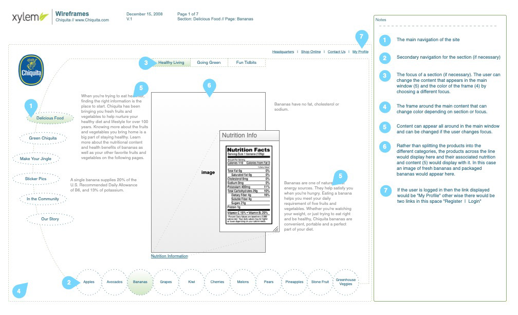
The first concept for a home page, that gave nutrition information
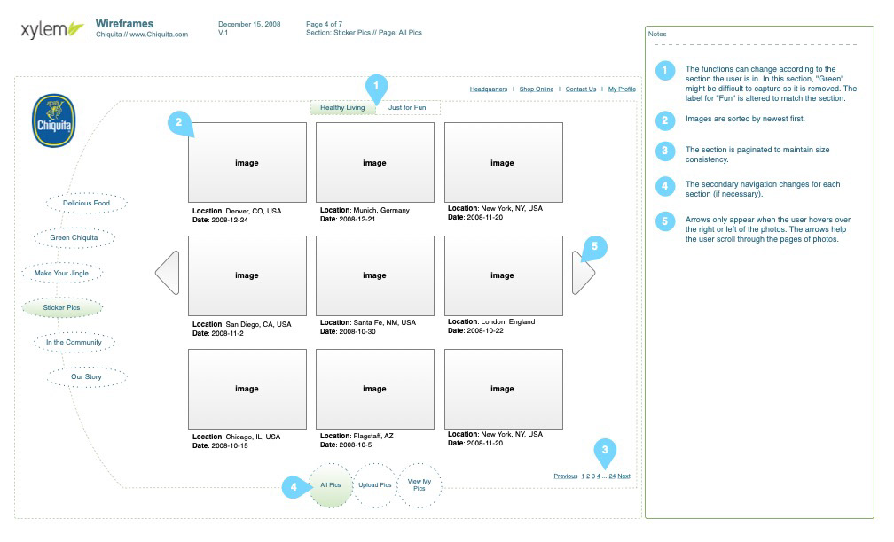
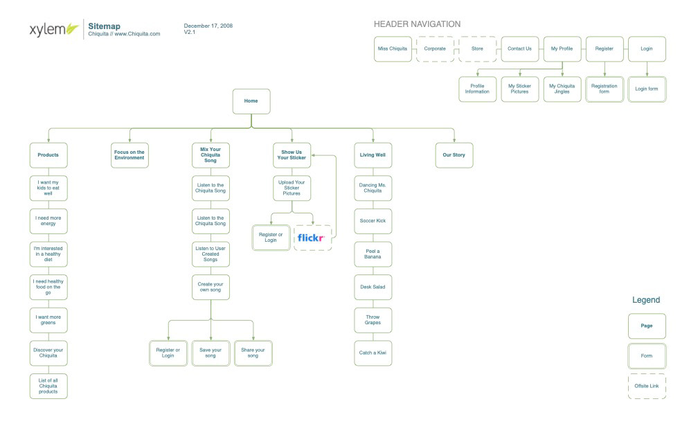
Some of the ideas were good in this phase, like sharing photos from Flickr
The Challenge
The agency aimed for a dynamic, all-Flash site with heavy motion and rich media. Meanwhile, the client wanted something engaging, but couldn’t articulate why the designs so far felt off.
I created an initial UX concept that balanced usability best practices with the team’s creative ambitions. But it still missed the mark. The client remained frustrated, and the core issue remained unclear.
Uncovering The Real Problem
The turning point came when I requested to sit in on a client call, despite being an external contractor. I suspected the disconnect might be more emotional than functional—and not easily expressed in traditional feedback.
During the conversation, a passing comment stood out: “We don’t want to be commodities based.”
That line revealed everything. The client didn’t just want a product showcase. They wanted their brand to stand for something deeper and more meaningful. A lifestyle, a set of values, an emotional connection.
That line revealed everything. The client didn’t just want a product showcase. They wanted their brand to stand for something deeper and more meaningful. A lifestyle, a set of values, an emotional connection.
The Strategic Shift
With that insight, I reframed the user experience to focus on what the brand meant to people, not just what it sold. The next iteration emphasized lifestyle storytelling, community, and values—moving beyond individual products.
The new concept shifted away from heavy product listings and instead explored what the brand represented in the lives of its customers. This direction resonated immediately. The client responded positively, and the project gained new momentum.
The Outcome
The client moved forward with the revised design strategy, ultimately deciding against a Flash-only execution due to usability concerns. That decision itself was a win—balancing the agency’s creativity with a more accessible, user-friendly approach.
What began as a design rescue turned into a strategic pivot, aligning the site with the brand’s identity and strengthening the client-agency relationship.
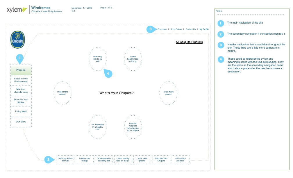
The new design focused on lifestyle, rather than commodities